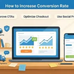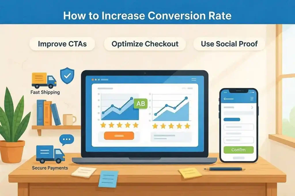
Running an eCommerce website can feel strange sometimes. Traffic looks good. Products are decent. Ads are bringing people in. Yet sales stay lower than expected. That situation comes up often during projects managed by Prodigy Marketing Agency in Dubai. Visitors arrive with interest but leave before buying. Most of the time the problem is not the product. It is an experience.
A lot of store owners think conversion rate growth needs a complete redesign. Usually it does not. Small fixes often create bigger results than expensive changes. A slow page. A confusing button. A product image that feels unclear. These things look minor until revenue starts slipping away.
What makes people leave an eCommerce website before buying?
People rarely leave because of one huge reason. Usually several small annoyances build up together. A page loads slowly. Product details feel incomplete. Shipping information is hard to find. The checkout process asks too many questions.
When shoppers feel even a little uncertain they often postpone the purchase. Later usually means never.
One fashion store had strong traffic but weak sales. After reviewing the customer journey it became obvious that size information was buried deep inside product descriptions. Customers kept leaving to search elsewhere. Once sizing details became easier to find conversions improved without changing products or advertising.
How important is website speed for conversion rates?
Website speed matters more than many people expect. Most visitors will not sit patiently waiting for a page to load. Online shopping is different now. People expect things instantly. A delay of a few seconds can break momentum.
Stores optimized by Prodigy Marketing Agency frequently see stronger engagement after speed improvements. Visitors view more pages. Bounce rates drop. Checkouts increase.
The interesting thing is that customers rarely say they left because of speed. They simply leave. That makes speed problems easy to miss. A faster website feels more trustworthy. It feels professional. Even before a visitor reads a single word.
Conversion Impact Data
| Website Factor | Average Effect on Conversions |
|---|---|
| Faster page load | Higher engagement |
| Clear navigation | More product views |
| Better product images | Increased confidence |
| Simple checkout | Lower abandonment |
| Visible reviews | More completed purchases |
| Mobile optimization | Better user experience |
| Transparent pricing | Stronger trust |
How can better product descriptions increase sales?
Many product descriptions focus too much on features. Features are useful but shoppers often care more about outcomes. Instead of saying a backpack uses reinforced stitching it helps to explain that it comfortably carries heavy books during long days. Instead of listing material details for a jacket explain how it performs during cooler evenings. That difference seems small but it changes how customers imagine ownership.
Good product descriptions answer questions before they are asked. They reduce uncertainty. They create confidence. Another common mistake is making descriptions too long. People skim. Important details should be easy to find. Simple language usually works best.
Why do product images affect conversions so much?
Online shoppers cannot touch products. That single fact makes product photography extremely important. Blurry images create hesitation. Limited angles create hesitation. Poor lighting creates hesitation. Clear photos showing texture size details and real world usage help visitors understand what they are buying.
One home decor store improved conversions after replacing basic supplier images with original photographs. Nothing else changed. The products stayed the same. The advertising stayed the same. Better visuals simply removed doubt. Customers buy with confidence when they can clearly see what they are getting.
How many checkout steps should an eCommerce site have?
Fewer steps are usually better. Every additional field creates friction. Every unnecessary question gives shoppers another reason to stop. Some websites ask for information that is not needed to complete a purchase. Customers notice that quickly.
The best checkout experiences feel effortless. Visitors move through them naturally without needing to think about the process. Guest checkout options help too. Not everyone wants to create an account before buying. Removing obstacles sounds obvious but many stores still make checkout harder than necessary. That lost convenience often becomes lost revenue.
The role of trust in conversion growth
Trust influences almost every purchase decision. Customers wonder whether products will arrive. They wonder if returns are possible. They wonder if payment information is secure.
Visible reviews help answer those concerns. Clear return policies help answer those concerns. Secure payment indicators help answer those concerns. None of these elements are exciting. They rarely appear in marketing discussions. Yet they quietly influence buying decisions every day. People buy when they feel safe.
Mobile users cannot be treated as secondary visitors
Many stores receive most of their traffic from mobile devices. Yet some websites still feel designed mainly for desktop screens. Buttons appear too small. Text becomes difficult to read. Product images load awkwardly. Menus feel cramped. These issues frustrate visitors faster than many business owners realize. Mobile optimization is no longer optional. It is part of the buying experience. A website that works beautifully on a phone often performs better everywhere else too.
Pricing transparency matters
Unexpected costs damage trust quickly. A product may look attractive at first. Then extra fees appear during checkout. Suddenly the purchase feels less appealing. Transparent pricing removes surprises.
Customers appreciate knowing exactly what they will pay. Discounts should be easy to understand as well. Complicated offers sometimes create confusion rather than excitement. Simple pricing usually wins.
Before & After Optimization Comparison
| Area | Before Optimization | After Optimization |
|---|---|---|
| Website Speed | Slow loading pages | Fast loading pages |
| Product Images | Limited visuals | Multiple clear images |
| Checkout Process | Many steps | Fewer steps |
| Navigation | Confusing structure | Easy browsing |
| Mobile Experience | Difficult usage | Smooth experience |
| Pricing Display | Hidden surprises | Transparent costs |
| Reviews | Hard to find | Clearly visible |
Why should store owners pay attention to search behavior?
Visitors using site search often have strong purchase intent. They already know what they want. If search results are poor, those motivated visitors become frustrated quickly. Accurate search functions. Useful filters. Relevant suggestions. These improvements help customers reach products faster. The less effort required the better. Convenience often becomes a competitive advantage.
Customer reviews still influence decisions
People naturally look for reassurance from others. A review describing real experience carries weight. Interestingly, perfectly positive reviews are not always the most convincing. A mix of opinions often feels more authentic. Authenticity matters. Shoppers want realistic expectations rather than exaggerated promises. Encouraging honest feedback creates credibility over time.
Email collection should feel helpful
Some websites show aggressive popups seconds after visitors arrive. That approach often feels intrusive. Offering genuine value tends to work better. A useful guide. Early product access. A reasonable discount. These incentives feel less disruptive and more helpful. Email marketing still works but the relationship should begin with trust rather than pressure.
Data removes guesswork
Analytics reveal where customers leave. They reveal where customers hesitate. They reveal where attention disappears. Without data many decisions become assumptions. Store owners sometimes focus on problems that are not actually hurting conversions. Behavior data often tells a different story. Small discoveries can lead to meaningful improvements. A checkout issue affecting thousands of visitors matters more than a homepage change nobody notices. That is why regular testing remains important.
Conversion rate optimization is rarely about one dramatic breakthrough. Most successful stores improve through many small adjustments. Faster pages. Better product photos. Clear descriptions. Easier checkout. Stronger trust signals. Thoughtful mobile experiences. Those changes may not look revolutionary individually. Together they create something customers notice immediately. A shopping experience that feels simple. And simple experiences tend to convert better.
What role does navigation play in eCommerce conversions?
Navigation does not get much attention compared to advertising or product pages. Still it affects nearly every visitor. When shoppers cannot find products quickly frustration starts building. Sometimes they leave after a few clicks. Sometimes they stay longer but never reach checkout.
Good navigation feels almost invisible. Categories make sense. Filters work properly. Menus stay clean. Customers move through the website without stopping to figure things out.
One electronics store reduced menu clutter and grouped products more logically. The change looked minor. Yet visitors started viewing more products per session. The path to purchase became easier. People like options. They do not like confusion.
Can live chat help increase conversion rates?
In many cases yes. Customers often have small questions before buying. They want clarification about delivery times. Product compatibility. Warranty details. Return policies.
Without quick answers they may leave the website. Live chat provides immediate support when uncertainty appears. Even a simple chatbot handling common questions can help.
Not every customer uses live chat. That is true. But for those who do it often becomes the final step before purchasing. The key is keeping responses useful and direct. Overcomplicated support creates another obstacle.
Why do abandoned carts happen so often?
Cart abandonment happens on nearly every eCommerce website. Sometimes customers are comparing prices. Sometimes they become distracted. Sometimes shipping costs appear higher than expected. There is rarely one universal reason. What matters is creating ways to bring those visitors back.
Reminder emails remain effective. Retargeting ads can help. Limited stock notifications sometimes encourage action. A furniture retailer noticed many shoppers abandoning carts after viewing shipping information. Once delivery details became clearer earlier in the journey abandonment rates improved. Customers dislike surprises. That pattern appears again and again.
The importance of clear calls to action
A surprising number of websites make buying harder than necessary. Buttons blend into the page. The action text feels vague. Important next steps are unclear. Visitors should never wonder what happens next. Simple phrases often work best – Add to Cart, Buy Now or Start Checkout. These instructions remove uncertainty. There is no need for clever wording if it creates confusion. Clarity usually outperforms creativity when conversions are the goal.
Social proof matters more than many businesses expect
People naturally watch what others are doing. A product with reviews feels safer than a product with none. Customer photos help too. Real experiences create reassurance that polished marketing cannot always provide. This becomes especially important for newer brands.
Shoppers may not know the company yet. Positive customer feedback helps bridge that trust gap. Social proof does not guarantee sales. It simply reduces hesitation. Often that is enough.
Returning visitors deserve attention
Many businesses focus only on attracting new traffic. That approach leaves opportunities behind. Returning visitors already know the brand. They may have explored products before. They may have almost purchased it. Those visitors often convert at higher rates.
Personalized recommendations can help. Relevant email campaigns can help. Recently viewed product reminders can help. The goal is not aggressive selling. The goal is making it easier for interested customers to continue where they left off. That small convenience often creates additional revenue.
Does personalization improve conversion rates?
Usually yes when it feels natural. Nobody enjoys feeling tracked excessively. Yet relevant recommendations can improve the shopping experience. A visitor viewing running shoes might appreciate related accessories. Someone shopping for baby products may find age specific suggestions useful.
Personalization works best when it solves a problem rather than forcing extra products into view. Helpful recommendations feel valuable. Irrelevant recommendations feel annoying. The difference matters.
Why testing should never stop?
Many store owners make improvements once and assume the work is finished. Conversion optimization rarely works that way. Customer behavior changes. Technology changes. Expectations change. A design that performed well last year may not perform as well today.
Regular testing keeps websites aligned with real user behavior. Button colors can be tested. Headlines can be tested. Checkout layouts can be tested. Product page designs can be tested.
Not every experiment creates improvement. Some changes actually reduce performance. That is normal. Testing replaces assumptions with evidence.
The hidden cost of poor user experience
Poor user experience creates losses that are difficult to measure directly. Visitors leave without explaining why. Potential customers disappear quietly. Opportunities vanish before reaching checkout. Many businesses focus heavily on attracting traffic while ignoring the experience after arrival. That imbalance becomes expensive. Traffic alone does not generate revenue. Conversions generate revenue. A website should help visitors move comfortably from curiosity to purchase. Every obstacle along that path has a cost.
Common conversion mistakes seen on eCommerce websites
Several issues appear repeatedly across different industries.
- Too many popup messages.
- Slow mobile experiences.
- Weak product images.
- Confusing return policies.
- Complicated checkout processes.
- Hidden shipping costs.
- Unclear calls to action.
Most of these problems seem small when viewed individually. Together they create friction.
Visitors rarely tolerate friction for long. The online marketplace gives people endless alternatives. Switching to another store takes seconds. That reality makes customer experience more important than ever.
How Prodigy Marketing Agency approaches conversion optimization?
Prodigy Marketing Agency in Dubai often focuses on understanding actual customer behavior before recommending changes. That approach sounds obvious but it is frequently overlooked.
Business owners sometimes assume they already know why conversions are low. Customer data often tells a different story. Heatmaps reveal attention patterns. Analytics reveal drop off points. Session recordings reveal frustration moments. These insights help prioritize improvements that matter most.
Instead of changing everything at once the focus stays on meaningful adjustments that create measurable impact. That process tends to produce more reliable results. Conversion growth usually comes from understanding people rather than chasing trends. The strongest eCommerce websites rarely succeed because of one secret tactic. They succeed because many small details work together.
- Fast loading pages create momentum.
- Clear product information builds confidence.
- Simple navigation reduces effort.
- Trust signals reduce risk.
- Mobile friendly experiences improve accessibility.
- Easy checkout removes friction.
- Each improvement supports the next.
Customers may never consciously notice every detail. They simply feel comfortable moving forward. That feeling matters. Online shoppers have countless choices. When a website feels easy, trustworthy and straightforward people stay longer. They explore more products. They complete more purchases. Conversion rate optimization is not really about convincing people to buy. It is about removing the reasons they hesitate. When those barriers disappear sales often follow naturally.
FAQs
Most websites can see early improvements within a few weeks after fixing major usability issues. Larger optimization projects may take several months. Results depend on traffic volume, customer behavior and how significant the changes are. Consistent testing usually delivers better long term outcomes than one time adjustments.
A good conversion rate varies by industry product type and traffic source. Many online stores operate between one percent and three percent. Some perform much higher. Rather than chasing averages it is often better to improve against current performance and focus on steady growth.
Yes. Small businesses often benefit significantly because even modest improvements can increase revenue without increasing advertising costs. Getting more sales from existing traffic is usually more affordable than constantly purchasing additional traffic through paid marketing campaigns.
Yes. Strong product pages help customers understand products quickly and confidently. Clear images, detailed descriptions, customer reviews and transparent pricing reduce uncertainty. When visitors have the information they need fewer doubts remain which often leads to more completed purchases.