
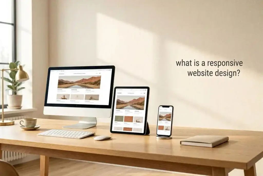
Some websites feel easy the second they open. Everything fits nicely. Buttons are clear. Text does not run off the screen. Nothing strange happens when moving from a phone to a laptop. That smooth feeling usually comes from responsive website design. It sounds technical at first. But really it just means the website changes shape and layout to fit the screen being used.
A few years ago many business websites in Dubai still looked like tiny desktop pages squeezed into phones. People had to zoom in just to read a menu. Some pages loaded halfway and froze. It felt messy and honestly a little annoying. Things changed fast though. Companies like Prodigy Marketing Agency started building websites that actually move with the device. That small difference changed how people stayed on websites and how often they left.
What does responsive website design actually do?
A responsive website design adjusts images, text buttons and sections so they fit properly on any screen. A website can look wide on a computer and still look clean on a small phone. Nothing feels cut off. The user does not need to struggle. That is the whole point really.
Sometimes people think responsive design is only about shrinking things down. It is more than that. Menus may move into simple icons. Pictures become smaller. Text spaces out better. Even forms become easier to tap with thumbs. Those little details matter more than expected.
A restaurant website in Dubai had a booking button hidden under a large image on mobile screens. Most visitors never found it. After the layout became responsive bookings increased within weeks. Nothing magical happened. People just stopped getting confused.
| Device | Average Time on Old Website | Average Time on Responsive Website |
|---|---|---|
| Phone | 40 seconds | 2 minutes |
| Tablet | 1 minute | 3 minutes |
| Desktop | 2 minutes | 4 minutes |
Why do users leave websites so quickly?
Most people leave because something feels difficult. Maybe the text is too small. Maybe the page jumps while loading. Maybe the menu covers half the screen. Nobody likes fighting with a website. Especially when another one is waiting right beside it.
There is something very human about this. If a page feels stressful users leave almost immediately. It happens without thinking much. A responsive website removes tiny moments of irritation. The visitor stays calmer. Things feel easier. Trust builds quietly.
One online clothing store in Dubai noticed many users abandoned carts on mobile devices. The checkout fields were hard to press and the payment page looked broken on smaller screens. After redesigning the mobile layout sales improved a lot. Not because products changed. The experience changed.
How does responsive design affect user experience?
User experience means how people feel while using a website. Responsive design affects almost every part of that feeling. Fast loading pages help users relax. Clean layouts help people focus. Easy navigation helps people trust the business more.
There is also comfort involved. A good responsive website feels natural. Users stop noticing the design because everything works smoothly. That is usually a sign the design is doing its job well.
A local real estate website once had huge images that looked beautiful on desktop screens but terrible on phones. The pictures pushed important information far down the page. Visitors got tired of scrolling endlessly. Once the layout changed the bounce rate dropped. Funny enough the design became simpler and users liked it more.
Sometimes website owners chase fancy animations and complicated effects. But many visitors just want clear information without delays. A plain responsive website often performs better than a flashy one that struggles on mobile screens.
Can responsive websites help search rankings?
Search engines pay attention to mobile experience now. A website that works poorly on phones usually struggles in search engine rankings too. Search engines want users to find useful websites quickly. If visitors leave after a few seconds the ranking may slowly fall.
Responsive design helps by keeping visitors engaged longer. Pages load better. Navigation works properly. Content stays readable. Search engines notice those patterns over time.
Google has mentioned mobile friendliness for years now. Yet many small businesses still ignore it until traffic drops. It is strange because the fix is often simpler than expected.
| Website Feature | User Reaction |
|---|---|
| Tiny text | Leaves quickly |
| Fast loading page | Stays longer |
| Broken mobile menu | Feels frustrated |
| Easy navigation | Clicks more pages |
| Responsive images | Trusts the website more |
What happens when a website is not responsive?
Things become awkward very fast. Images stretch strangely. Buttons overlap text. Some links stop working properly. On older websites there is often horizontal scrolling which almost nobody enjoys using.
A travel agency website once showed desktop popups that completely blocked the mobile screen. Closing the popup was nearly impossible because the button sat outside the phone display. Visitors complained often. The business lost leads simply because people could not use the page comfortably.
There is also the issue of speed. Non responsive websites usually load unnecessary elements that slow down mobile devices. Slow pages create impatience. People start tapping randomly or leaving before the page finishes loading.
Responsive websites feel more modern even when the design itself is simple. Maybe it is because users connect smooth experiences with professional businesses. A broken website creates doubt very quickly.
Why are mobile users so important now?
Most people browse through phones almost all day. They search restaurants while walking. They compare prices during shopping. They check reviews while sitting in cars or cafes. Mobile browsing is no longer secondary. For many users it is the main way of using the internet.
That shift changed website design completely. Businesses that ignored mobile visitors started losing attention. A desktop only website now feels old almost immediately. Some younger users even assume a business is inactive if the website works badly on phones.
A small beauty salon in Dubai noticed nearly all booking traffic came through mobile devices after evening hours. Customers were browsing from couches and beds instead of office computers. Once the salon improved its responsive design bookings became smoother and fewer people abandoned forms halfway through.
There is something practical about responsive websites too. Business owners do not need separate desktop and mobile websites anymore. Everything works from one flexible design. Updates become easier. Maintenance becomes less stressful.
Can responsive design improve trust?
Yes. Probably more than many people realize. People judge websites very quickly. A messy mobile page makes visitors wonder if the business itself is careless. That may sound harsh but it happens all the time.
A clean responsive website creates comfort. Users feel guided instead of lost. Contact pages work properly. Maps open correctly. Forms fit the screen. These small things quietly build confidence.
One repair company had strong customer reviews but an outdated website. The phone version looked cramped and uneven. Some visitors thought the business was closed because the layout felt abandoned. After redesigning the site the company started receiving more direct calls. Same workers. Same prices. Different online experience.
Responsive design also helps accessibility. Older users often struggle with tiny text and crowded layouts. Better spacing and readable screens help more people use the website comfortably. That matters more than fancy graphics honestly.
Does responsive design affect online sales?
Very often yes. People buy more when the process feels easy. Confusing layouts create hesitation. Slow pages break momentum. A smooth responsive website removes those barriers quietly in the background.
An online electronics shop once reduced the number of checkout steps on mobile screens. Buttons became larger and pages loaded faster. Sales increased because customers stopped getting annoyed halfway through the process.
The emotional side matters too. Shopping online already involves trust. If the website feels unstable users worry about payments and personal details. A responsive layout feels safer somehow even if users cannot explain exactly why.
Sometimes businesses spend huge amounts on advertising but forget the website itself. Visitors arrive from ads then leave because the mobile experience feels clumsy. That wasted traffic can become expensive very quickly.
What should businesses focus on first?
Speed is probably the best starting point. Users become impatient with slow websites almost instantly. Large images, complicated animations and heavy layouts often create problems on phones.
Clear navigation matters too. Menus should stay simple. Contact buttons should remain visible. Users should not search endlessly for basic information.
Readable text is another thing people forget. Tiny fonts may look stylish to designers but feel exhausting on smaller screens. Comfortable spacing helps users stay longer without frustration.
Responsive design is not really about chasing trends. It is about respecting the visitor experience. Businesses that understand this usually keep users around longer.
FAQs
The biggest advantage is comfort for the user. People can visit the website from any device without struggling to read, click or navigate. That smooth experience keeps visitors interested longer and helps businesses avoid losing potential customers because of simple design problems.
Dubai businesses compete heavily online and many customers browse through phones first. A responsive website helps companies look modern, reliable and easier to trust. It also helps local businesses reach tourists, residents and younger users who expect fast mobile friendly experiences every day.
Yes. It often does. Visitors leave quickly when pages feel broken, slow or difficult to use. Responsive websites improve readability speed and navigation which makes users stay longer. Even small layout fixes can change how comfortable people feel while exploring the website.
The time depends on the size and complexity of the website. Small business websites may take a few weeks while larger ecommerce platforms can take longer. Good responsive design usually requires testing across phones, tablets and desktops to make sure everything works naturally.